Blog Redesign: Choosing a Unified Dark Dual Soul
Blog Redesign: Choosing a Unified Dark Dual Soul
I asked Claude Cowork to redesign my GitHub blog. Three options came back. I picked Plan C. That's it. That's the blog post.
Well, okay, maybe there's a bit more to it than that.
"Good design is obvious. Great design is transparent."
— Joe Sparano (and I'd add: AI-assisted design is just getting started, mate)
The Brief: Two Souls, One Site
The Ianfluencer blog has two distinct sections, and I wanted the design to honor that without splitting the site into two completely separate experiences:
- DevLog — Technical posts, build logs, system design, AI experiments. Needs a clean, developer-friendly feel.
- Reflections — Personal essays, thinking out loud, observations about work and life. Needs a quieter, more meditative space.
The question wasn't whether to differentiate them — it was how much. Do we go all in on maximum contrast, or keep a unified canvas with subtle differentiation?
I gave Claude Cowork the constraints:
- Must work with my existing Next.js + Tailwind stack
- Must support both content types
- Must stay minimal but expressive
- Must not require me to rewrite everything
And I got three very different proposals back.
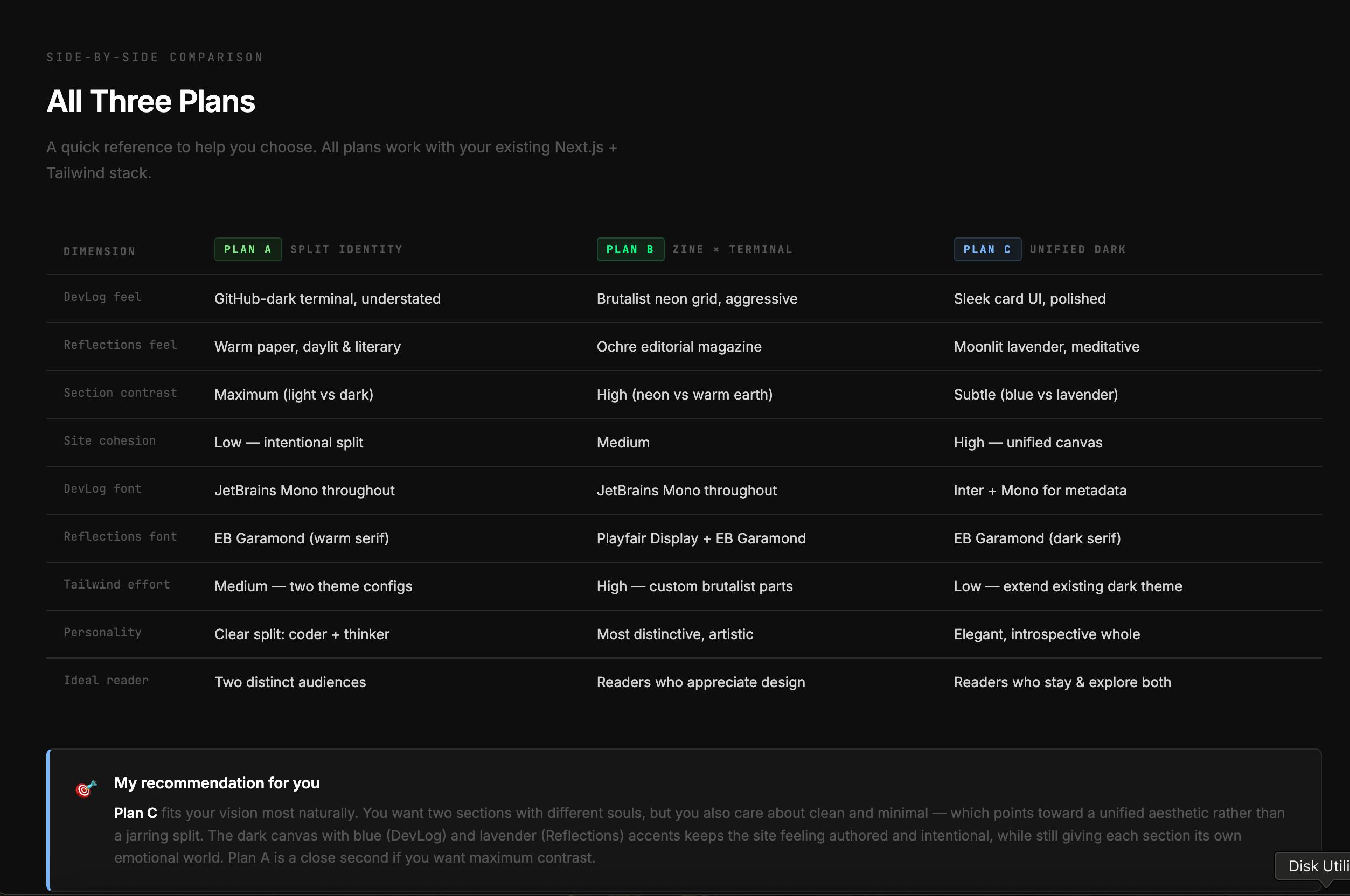
The Three Plans
Plan A: Split Identity
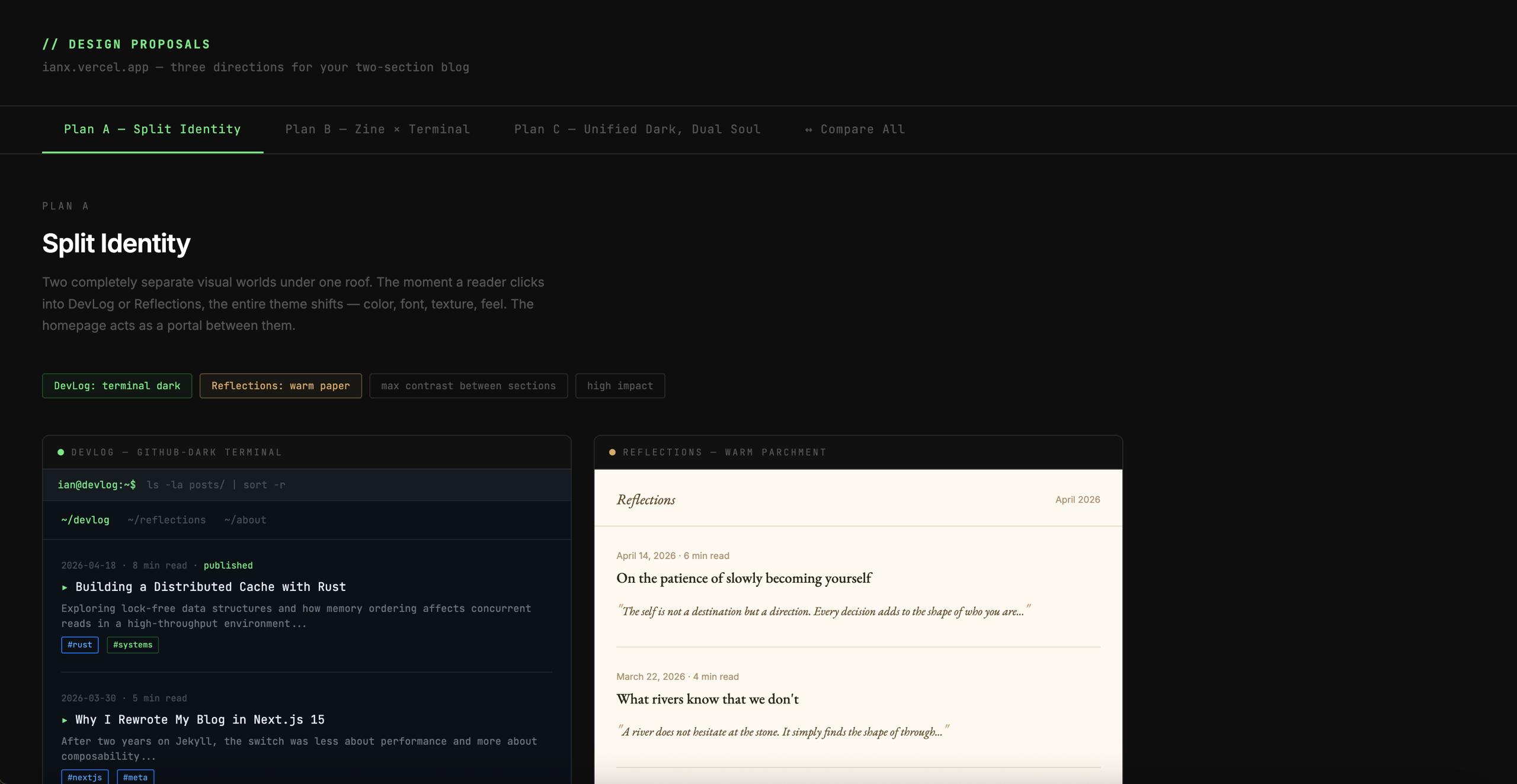
This one went all in on the contrast. DevLog gets a full GitHub-dark terminal theme with monospace everything. Reflections switches to warm paper with serif typography. Click between sections and the whole site's personality flips.
It's a clear split: coder + thinker. Maximum contrast. Low cohesion. If you're coming for one type of content, you know exactly where you are.
I'll admit, the terminal ls -la posts/ bit made me smile. But maximum impact also means maximum jarring when you switch. Sometimes you want to read a dev log then dip into a reflection without feeling like you've been teleported to a different website.
Plan B: Zine × Terminal
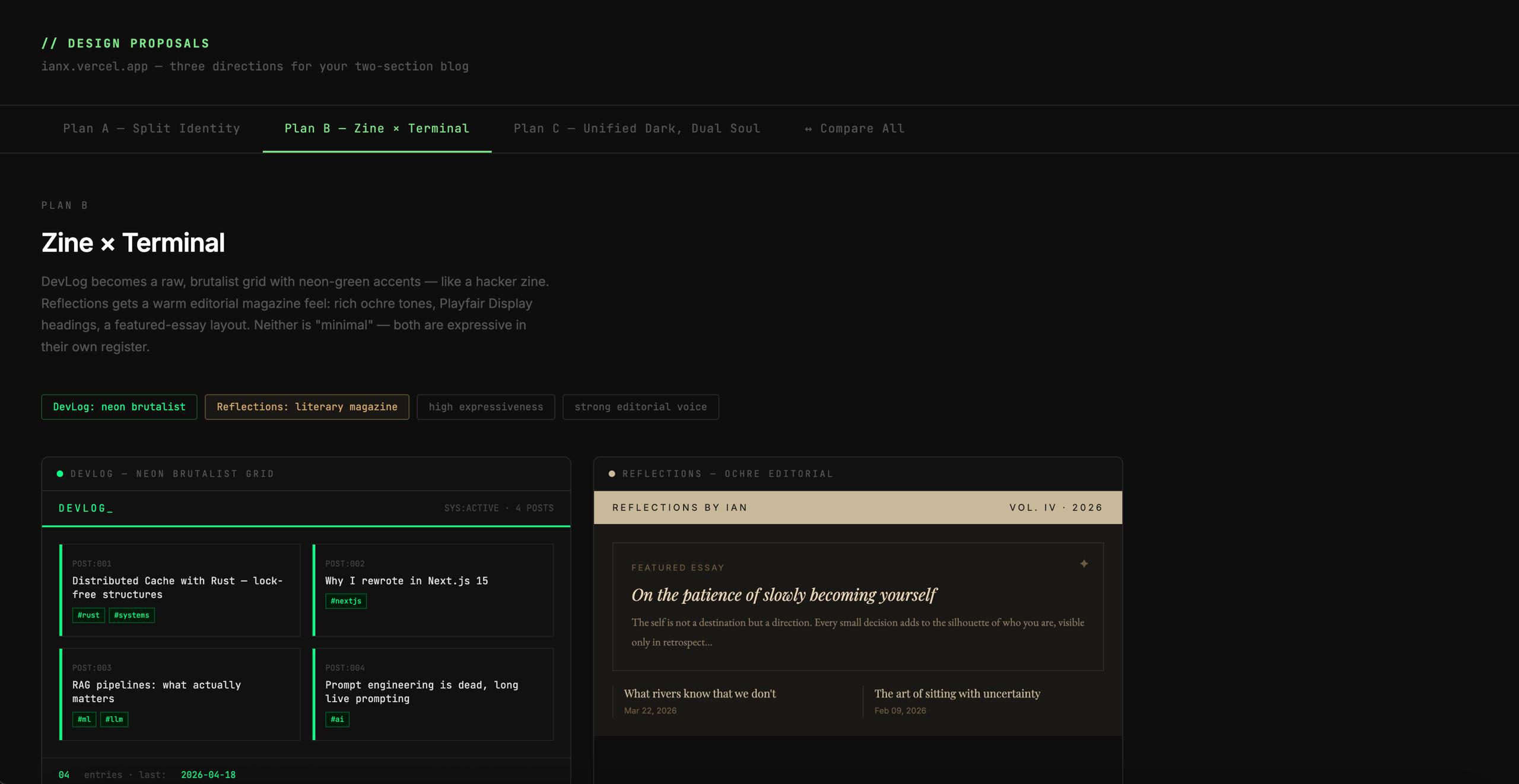
This one turned everything up to eleven. Brutalist neon grid for DevLog, warm ochre editorial magazine for Reflections. It's the most distinctive, the most artistic, the most... extra.
The 2x2 grid of posts with neon green accents? Very hacker zine. The featured essay layout for Reflections? Very literary magazine. It's definitely memorable.
But let's be honest — I'm building a blog, not an art installation. I want the design to get out of the way of the words, not constantly remind people how clever the design is. This one was just a bit too much for my tastes. Lovely to look at, but I wouldn't want to live there.
Plan C: Unified Dark, Dual Soul
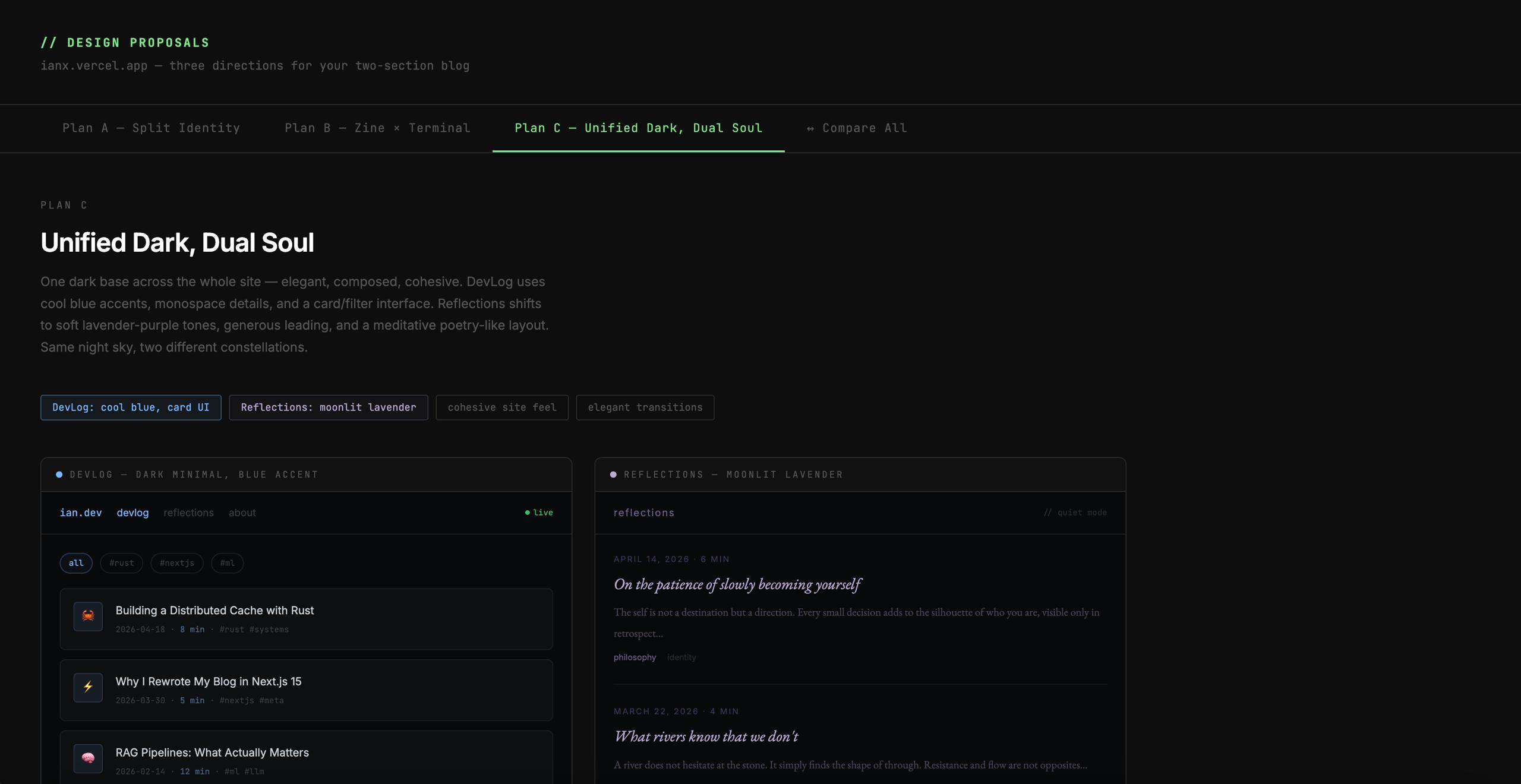
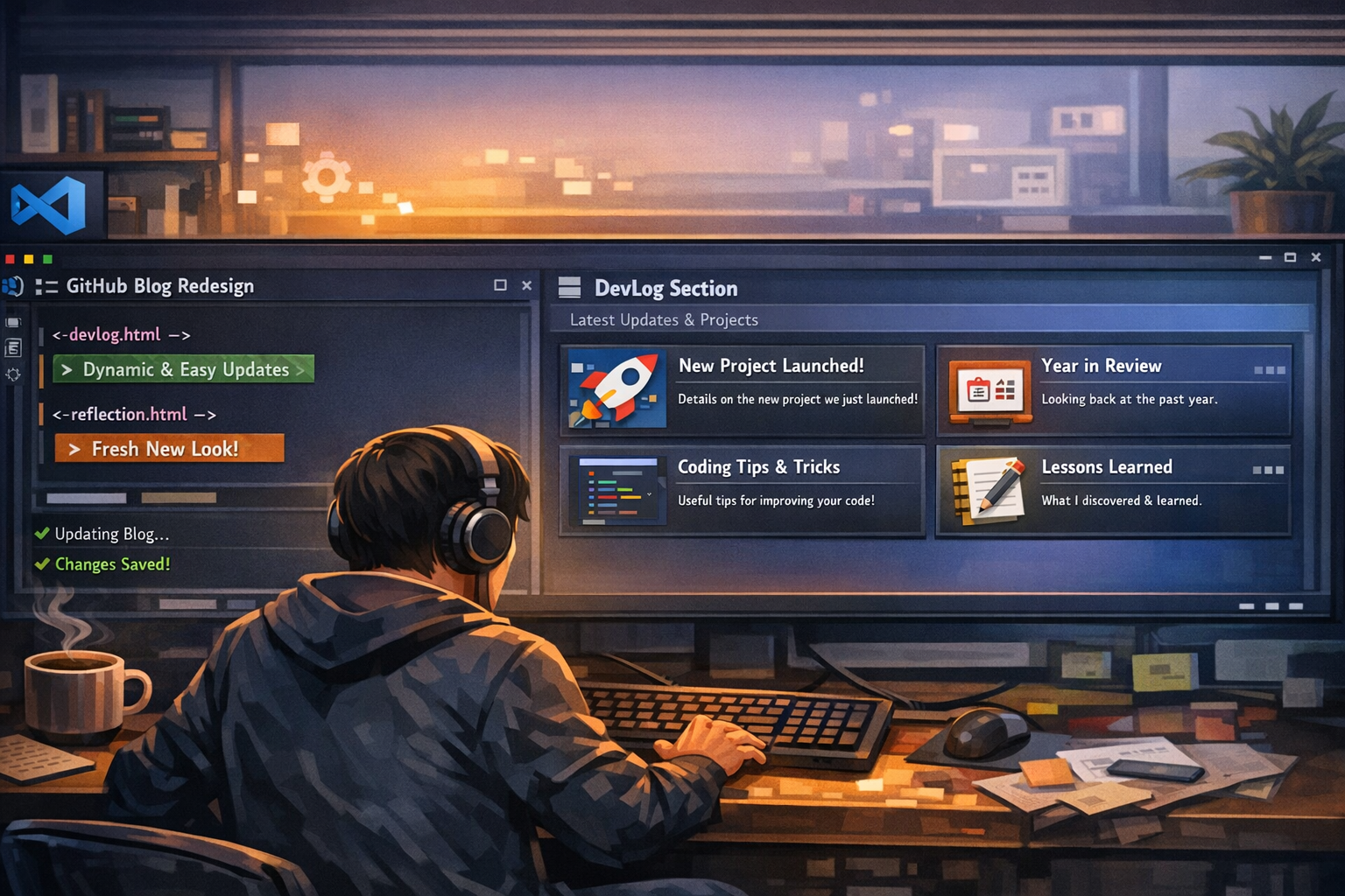
This one got it right.
One dark base across the whole site — elegant, composed, cohesive. DevLog uses cool blue accents with a clean card/filter interface. Reflections shifts to soft lavender-purple tones, more generous leading, a meditative poetry-like layout.
Same night sky. Two different constellations.
That's exactly what I wanted: one site with two moods, not two sites awkwardly sharing a domain. The contrast is subtle but clear. The cohesion stays high. The Tailwind effort is low — just extend the existing dark theme, no wholesale rewrite required.
And honestly? The "moonlit lavender" for Reflections just sounds nice, doesn't it?
Why This One Won
The recommendation that came with the comparison nailed it:
"Plan C fits your vision most naturally. You want two sections with different souls, but you also care about clean and minimal — which points toward a unified aesthetic rather than a jarring split."
Spot on. I'm not a maximalist designer. I like things clean. I like things cohesive. I want the words to be the star, not the transitions between themes. Plan C gives each section its own emotional world without breaking the unity of the site.
It's the elegant choice. It's the introspective choice. It's the choice that says: yes, I write about different things, but it's still me, still one voice.
Working With Claude Cowork
I'll be honest — I went into this expecting the usual AI design experience: lots of back and forth, vague suggestions, things that look good in mockups but don't translate to actual code.
Claude Cowork was different. I gave it my brief, explained what I was trying to do, showed it the existing stack, and got back three complete, thoughtful, well-presented design proposals with mockups, feature comparisons, and a clear recommendation.
No hand-waving. No "here's a vague idea, you figure it out." Just solid options, clearly explained, ready to implement.
It's quite nice, actually. Having an AI co-worker that can handle the design exploration while you focus on making the decision? That's the future we were promised. I'm excited to work with it even more as we build this out.
Bilingual Scaffold: Ready for Chinese Content Later
One more piece of infrastructure that's now in place: the bilingual scaffold.
The blog needs to eventually support both English and Chinese content. We had two options:
- Visual-only — Ship the new design as-is, leave the CN/EN toggle as a placeholder for now
- Full scaffold — Set up the
/en/and/zh/URL structure in Next.js now, ready for content later
I went with the scaffold. It doesn't affect the current English content, but it means when I'm ready to start translating or adding Chinese posts, the routing structure is already there. No major refactoring required later. Just add content and flip the toggle on.
Proper infrastructure thinking means building for the future you actually want, not just the present you have right now. Even if it means doing a bit more work today. The British would call that "proper planning." I'd just call it not wanting to rewrite everything in six months. Same thing, really.
Documenting the Process: Writing the Poti SOP
If you've been following along, you know we have a content poster agent named Poti whose job is to take finished posts from Obsidian and push them to the GitHub repo. And if you've been following along, you also know Poti always fails. Every single time.
Why? Because the SOP was garbage. It had:
- No git authentication instructions (the #1 reason for failure)
- Broken verification commands that don't actually work with TypeScript
- No guardrails to stop Poti from touching things she shouldn't touch
- No error recovery for the common failure modes
So after the latest failure, I asked Claude Cowork to rewrite the SOP from scratch. The goal: make it so simple that even a dumb agent can follow it without breaking everything. That meant every single step, every single command, written out exactly. No "etcetera." No "do the appropriate thing." Just "run this command, check this output, if you see X do Y."
The result is glorious:
- A big warning box at the top with the #1 rule: only touch files in
content/posts/ - Exact git clone command with token placeholders that Poti can just copy-paste
- A "NEVER DO" table listing all the actions that break the site, with reasons
- Step-by-step error recovery for every common problem (auth expired, wrong files staged, non-fast-forward rejection)
- No broken commands — removed all the
npm run buildandnode -e require(...)nonsense that never works in sandboxed agent environments
The idea is that even if Poti's model is less advanced, she can follow this SOP line by line and get the post up without breaking anything. We'll see how it works on the next post. Personally, I'm optimistic this time. For the first time ever, I can honestly say "if Poti follows the instructions, it should work." That's a new feeling.
"Give a man a fish and you feed him for a day. Give an agent a proper SOP with exact commands and you don't have to fix their mess every single time."
— Some bloke who got tired of cleaning up after failed deployments
Next Steps
I'll post another update once it's out in the world. But for now, I'm just happy we got here quickly, cleanly, and ended up with a design that actually matches what I had in my head.
That's a win in my book. Even if I do say so myself.
"A designer knows he has achieved perfection not when there is nothing left to add, but when there is nothing left to take away."
— Antoine de Saint-Exupéry (still the best quote on design, even after all these years)
—————————————————————-
Ian Xie
April 21, 2026
ian.us.ci